Website powered by

The Making of: Judge Dredd Sample Script

Making Of / 30 August 2021

One of the personal aims when deciding to take the Comics Master course was to test my ability to draw a manga with a legitimate Manga style. When the 2000AD assignment came up, I felt it was an excellent assignment to challenge myself in this way. I chose the Cycle of violence script by Robbie Morrision because it showcased Dredd the most, and it was a story that I felt could be seen within a Manga context.


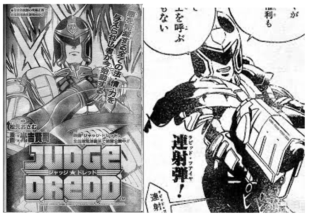
Fig. 1 images from Weekly Shounen Jump Season Special 1995


In Fig. 1, to my good luck, a Judge Dredd manga already existed, and it gave me precedence along with reference material for Dredd's design. The Manga was a season particular within Shounen Jump. Because it was from the mid-90s, Dredd has a very Power Ranger feel to him, which I loved because the Power Rangers are, in a sense, the Japanese embodiment of UK's Dredd, fighting evil and preserving justice, but in a Japanese way. 


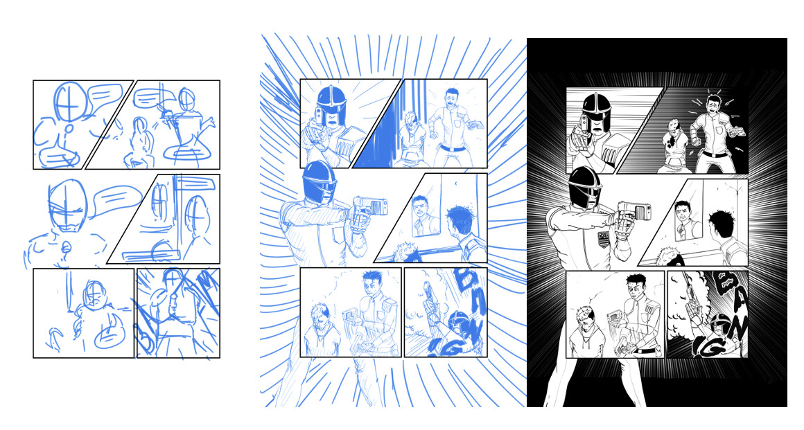
Fig. 2 Thumbnail to inked of Page 6


Fig.2 depicts my final design of Dredd, and I chose to simplify his costume and thin down some aspects of his helmet. 


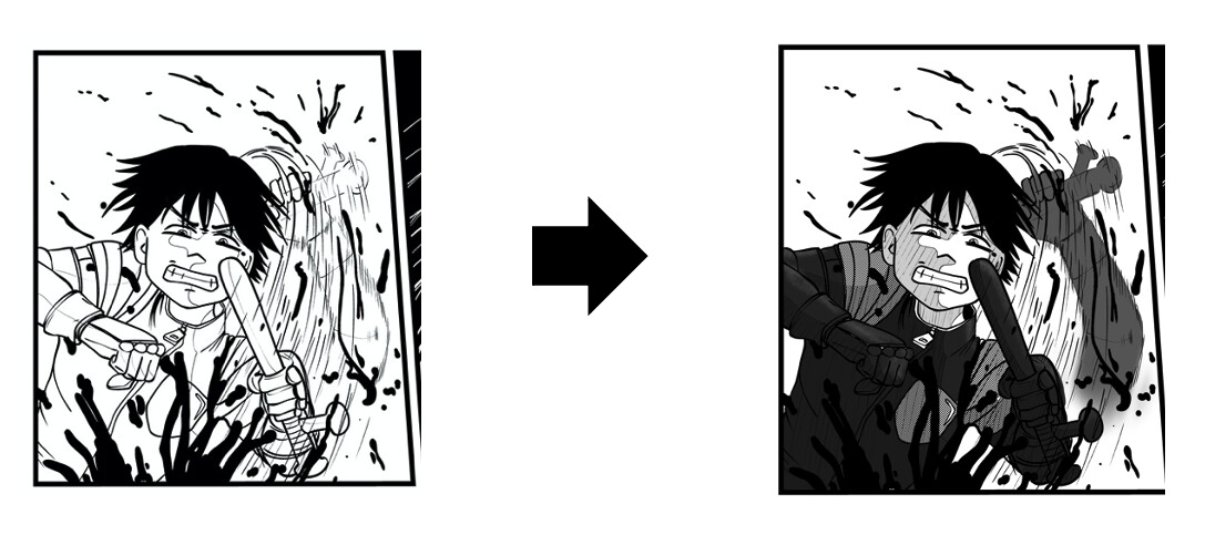
Fig. 3 panel 1 of page 3


Elements that make Manga feel like classic Manga are motion effect lines, expressions, sound effects, and halftones. Fig. 3 depicts my attempt to recreate those manga techniques. The Bang sound effect in Fig 2, composed of vertical text, uncommon in western comics, was also inspired by Manga SFX.


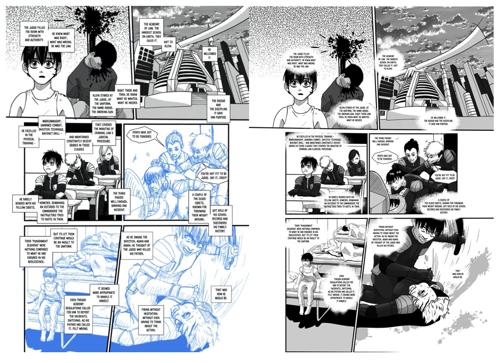
Fig. 4 Page 2 lettering

The final element that I feel makes work become truly Manga is the lettering. This was the most significant challenge for me in this assignment. The Dredd script, as it is a western script, is hugely text-heavy for a Manga. I felt that if I lettered the comic with western-style balloons and caption boxes, it would immediately detract from the manga feel. The left page in Fig. 4 was my first lettering attempt. Something commonly seen in Manga is square text boxes with a large amount of white space around the text (again, possible because the scripts are greatly deconstructed, and each page contains about ¼ of the text found here).

But as you can see in my first attempt in Fig. 4, the text was complicated to follow and crowded the entire page, ultimately detracting from the imagery. The right page in Fig. 4 was a second approach to lettering. Fuzzy balloon boxes are also standard in Manga, and I found that these balloons did not feel as overbearing as the other square ones while maintaining the manga effect. 


Read the completed Pages here


The Making of 2 Page Beano

Making Of / 30 August 2021

The Beano was the most challenging projects to date. When setting out on this project, my personal challenge was to create a work that was Beano-esque as opposed to a Beano that was in my style. For this reason, I felt it essential to use the balloons, text, and sound effects provided by the Beano staff and lettering entirely in InDesign (which was a learning curve all in itself). I also recreated the border styles that can be found in Beano comics. I chose this approach because I felt I am often far too comfortable drawing within my style, and I wanted to see if I could emulate another style without compromising my workflow too much. 


Fig. 1 work in progress of page 1 of Minnie Script


While working on this, I was surprised to find that my workflow was not compromised, at least not in a technical sense. However, my motivation to complete the task was greatly diminished. I learned that a lot of the joy in drawing could be taken away when forcing yourself to draw in ways you aren't interested in. The page in Fig. 1 took me a day to get to that stage, which was pretty quick; however, it stayed in that state for quite a few weeks before I even felt I could pick it up again. 


Fig. 2 Lettering modifications 


Despite having left 1/3 of most panels free for lettering, the main issues pointed out by the Beano editors were relating to my balloon placement.   Fig 2 shows a couple of panels and how I reworked the lettering by moving balloons around to ensure vital aspects of the imagery were not covered. 


To read the full Beano Comic click here.

The Making of Cryogenic

Making Of / 30 August 2021

In 2016, I began writing an epic-length Sci-fi light novel series titled Cryogenic. This endeavor was never completed. I chose to write a light novel over other literature formats to justify the presence of large quantities of illustrations. In my enthusiasm, I joined various writing groups, and progressively over a year, my ideas and perceptions of novel formats were shot down. Thus, my spirit vanished, and Cryogenic was shelved. When the assignment for a webcomic came up, I immediately knew it would be a perfect format for my dusty old unfinished light novel, and for the first time in 5 years, I felt as if I could remove Cryogenic from its shelf. 


 Story:

However, since I had spent a year's worth of story development on what was essentially to be an entire series of light novels, the plans for Cryogenic were extensive. For my webcomics class assignment, I chose to produce the first half of chapter 1 of Cryogenic. This is why you will find that in it's current state it does not have an extremely conclusive ending.


     I chose the title Cryogenic for two reasons. Firstly, within my story, cryogenic sleep is an integral part of the main character's environment, the space colony. Secondly, I felt it was a poetic metaphor for the physiological state in which all the characters are in; on the space colony, people have forgotten how to express emotions. On earth, they've forgotten their historical past and lost all knowledge. 

     Because my webcomic's story was initially written out in prose, my first step in the scriptwriting process was to convert the prose I had already written into a comic script. For the webcomic assignment, I chose the first segment of my novel, the protagonist's dream sequence leading to his startling awakening. However, for the context of the chapter, below is the overarching story Logline.


Logline:

Assuming the earth is no longer inhabitable, space colonists who split their time on their colony via cryogenic sleep clash with oppressed non "space dwellers" from the earth. Some humans struggle to come to peace with their fates. Which reality will prevail?


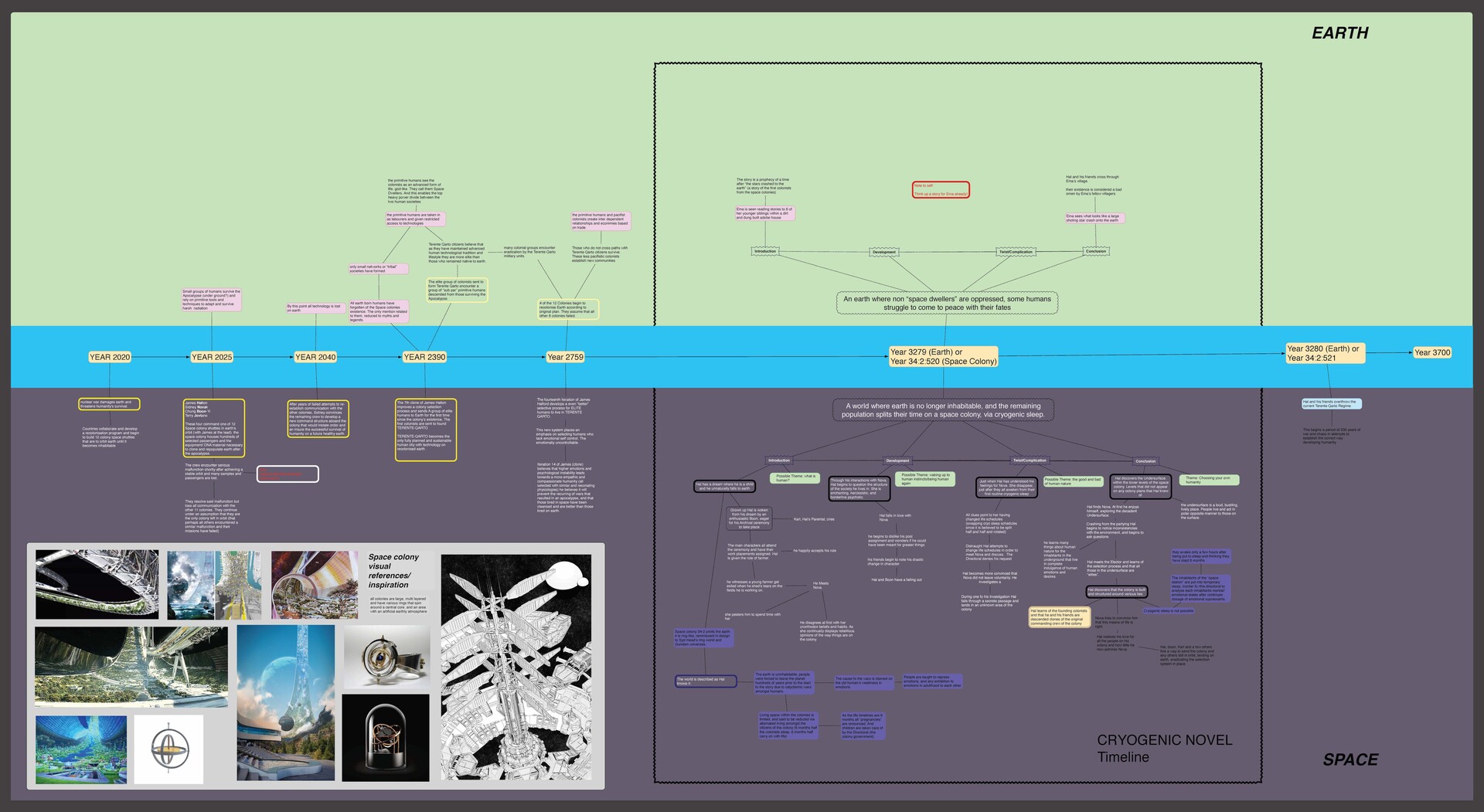
     I envision cryogenic as a juxtaposition of Hal's space colony (which represents pro-technology) and those on earth (representing the rejection of technology). Fig 1 is the mind map where you can find the entire epic saga story outline along with my initial design research for the space colony. 


Format/Platform:

With my script created, the next step in my process was to determine the right platform for Cryogenic with particular emphasis on having it be both easily manageable and accessible. As the written story follows multiple characters and perspectives, my original vision for this webcomic was to create a non-linear storyline, allowing for the free exploration of the various narratives. I prototyped a few website designs on Adobe XD to allow for that format. Please note that the designs in the prototypes are minimal and were purely to establish how the mechanisms would work quickly.


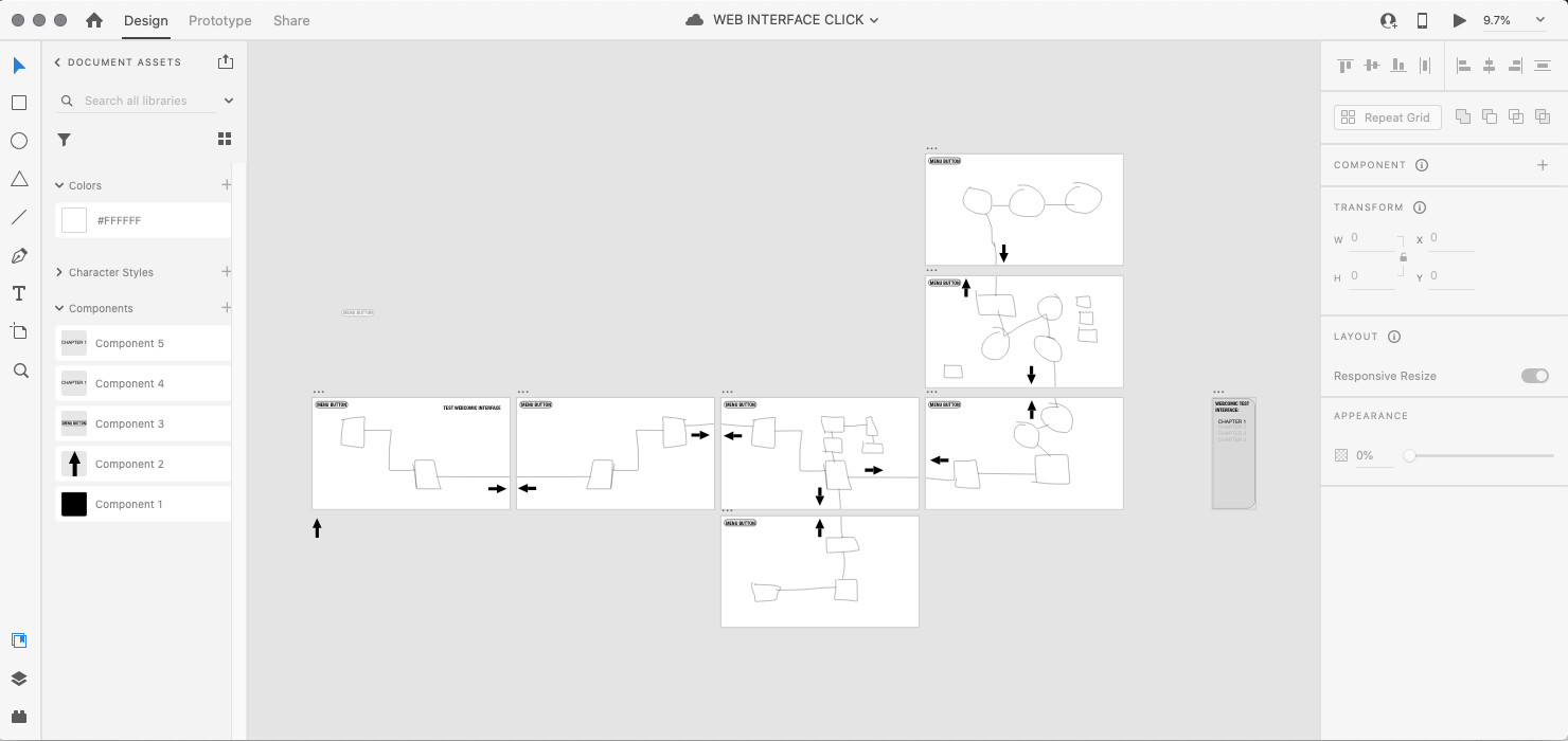
Fig 2. Test version with click mechanism (If you wish to view this test, you can visit: Here)


The first, which you can see in Fig.2, is a simple solution: to branch out and have the reader click on arrows to choose directions. I felt this was an effective navigation system, and the menu button would allow the reader to return to start at any point in the reading. However, it was pretty tedious for its simple final result to ensure that every forward and backlink was correctly directing the user. 


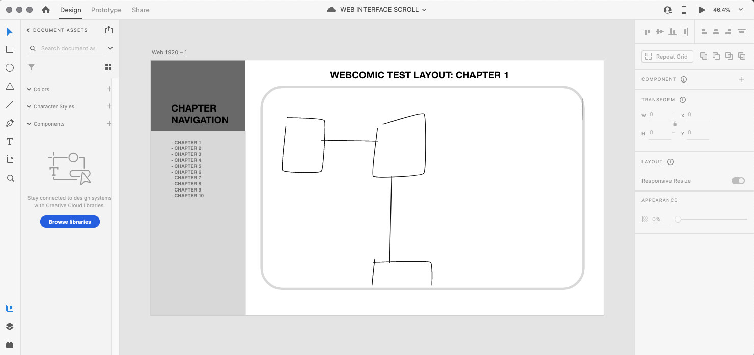
Fig 3. Test version with click and drag mechanism (If you wish to view this test, you can visit: Here


The second, which you can see in Fig.3, is even simpler, allowing for a large format png of the chapter to be uploaded and for the user to move the "map" of the chapter along. However, I felt this made the direction of the narrative unclear, which could be used intentionally, but I didn't feel it fit the already complex narrative of Cryogenic. It also is not the most convenient for non-touchscreen viewing devices, and as I intend to continue this webcomic in the future, I needed a platform that many could access.


Fig 4/5. A snapshot of a compiled webflow test


The third test, and the platform I chose to go with, was on a free hosting site called webflow. I chose this hosting platform because it allows for simple coded constructions of parallax and basic animated HTML features. Thus, I decided to reject my initial idea for a non-linear storyline in favor of the easily manageable infinite scroll and extra features of webflow. 

In Fig.4/5, you can see the elements I used to construct the webflow test. I only spent an hour incorporating three of the features and immediately found it was intuitive software. The free version of the platform only allows for two projects with two pages in each, but for this assignment, it was enough. Here is a link: (https://webflow.com/interactions-animations) of the platform's capabilities; I have yet to test them all out, but they are all features that I have always felt could be incorporated into the mechanics of a sequential story. I did experience incredible enjoyment building the third test, and despite it not being anything like my original idea, It was clear that I had an urge to explore this platform.


Character Designs:


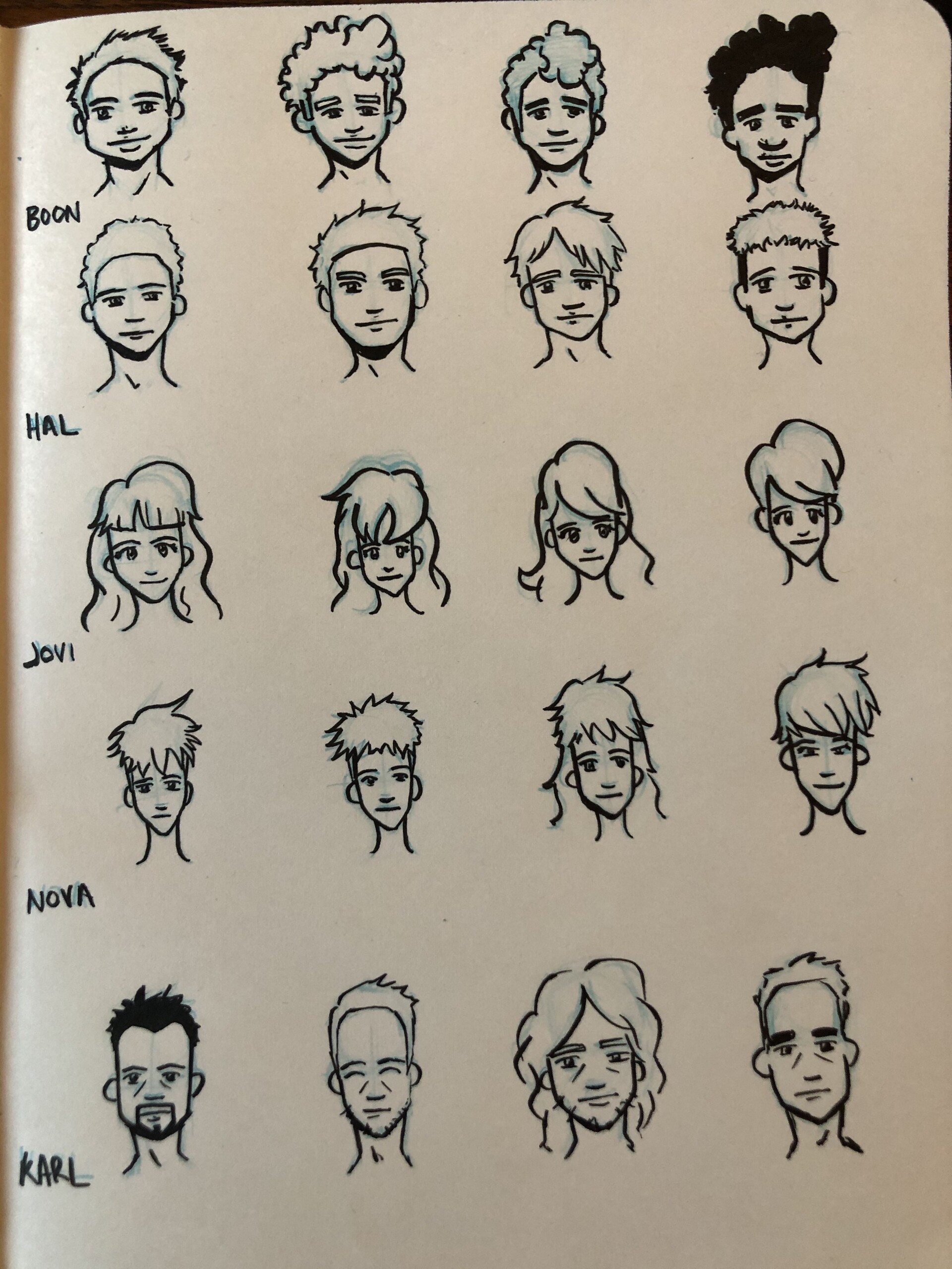
Fig. 6 Quick sketches to determine basic features of each character


The next stage for me was to pinpoint how the main characters would look like. Though chapter one only has Hal and Boon present, I still felt I needed to explore how they would look in relation to the other main characters. Fig. 6 shows some of those initial explorations.


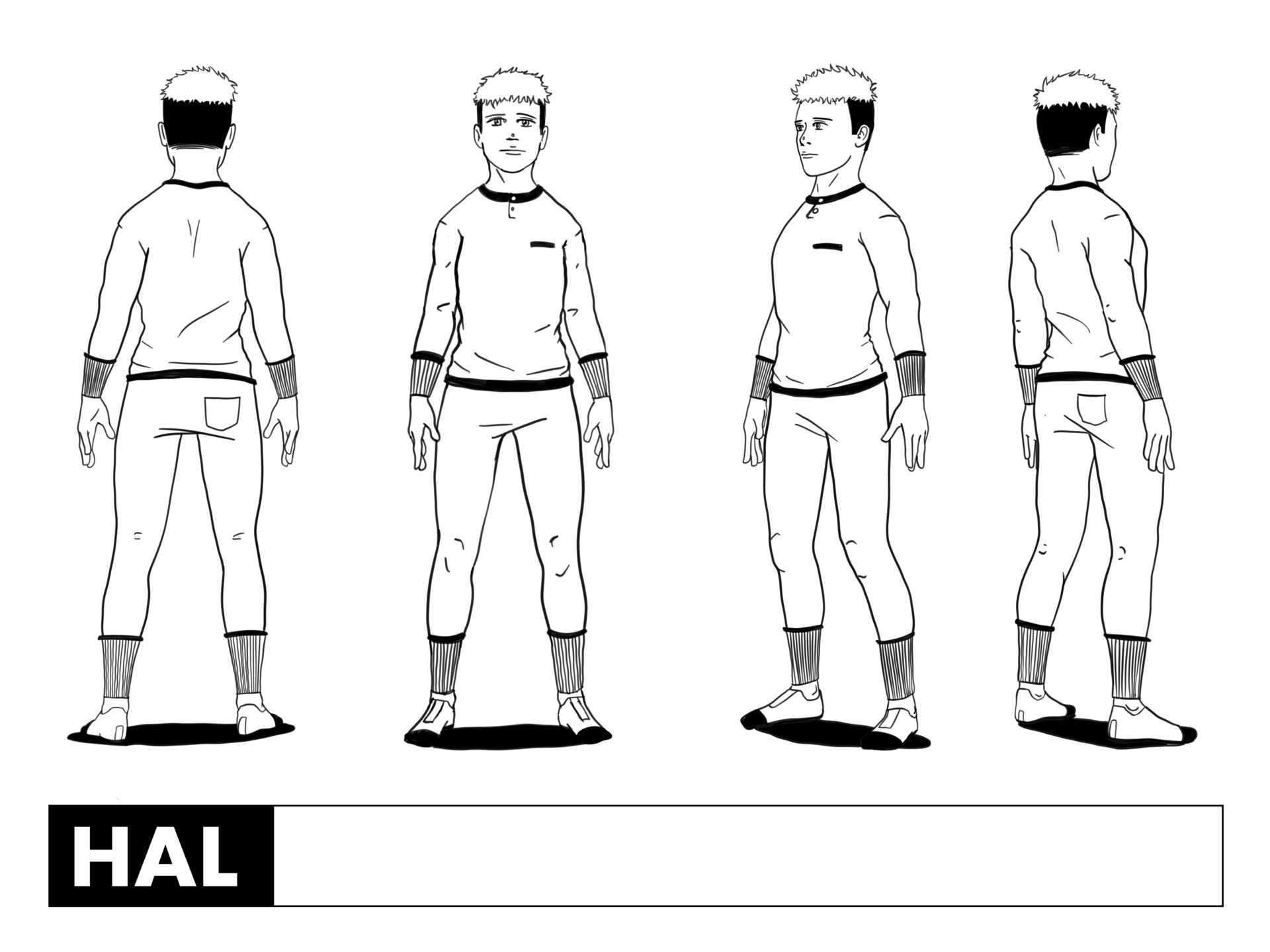
Fig. 7 Character Sheet for Hal


In Fig. 7, you can see my final draw-up for Hal. Although he is meant to be quite an apathetic and shy character, he is the main protagonist for the space colony arcs, and so I felt the skin fade hair cut would allow him to stand out from the others. I am mainly considering that nearly all characters will be in uniform. 


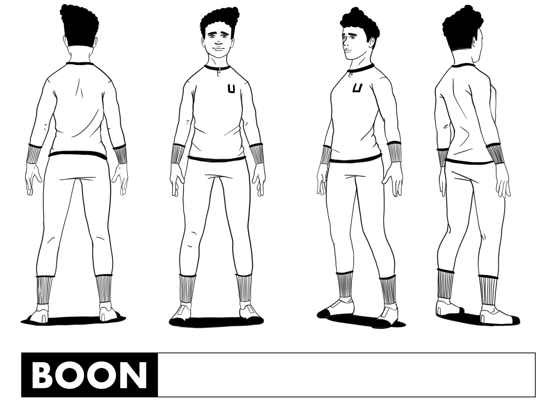
Fig. 8 Character Sheet for Boon


Boon, in Fig. 8, has quite the opposite personality to Hal's. He is confident, enthusiastic, and energetic. I envisioned him to have the physical characteristics of a Latino, as I relate a lot of those characteristics to my own culture.   


Logo Design:


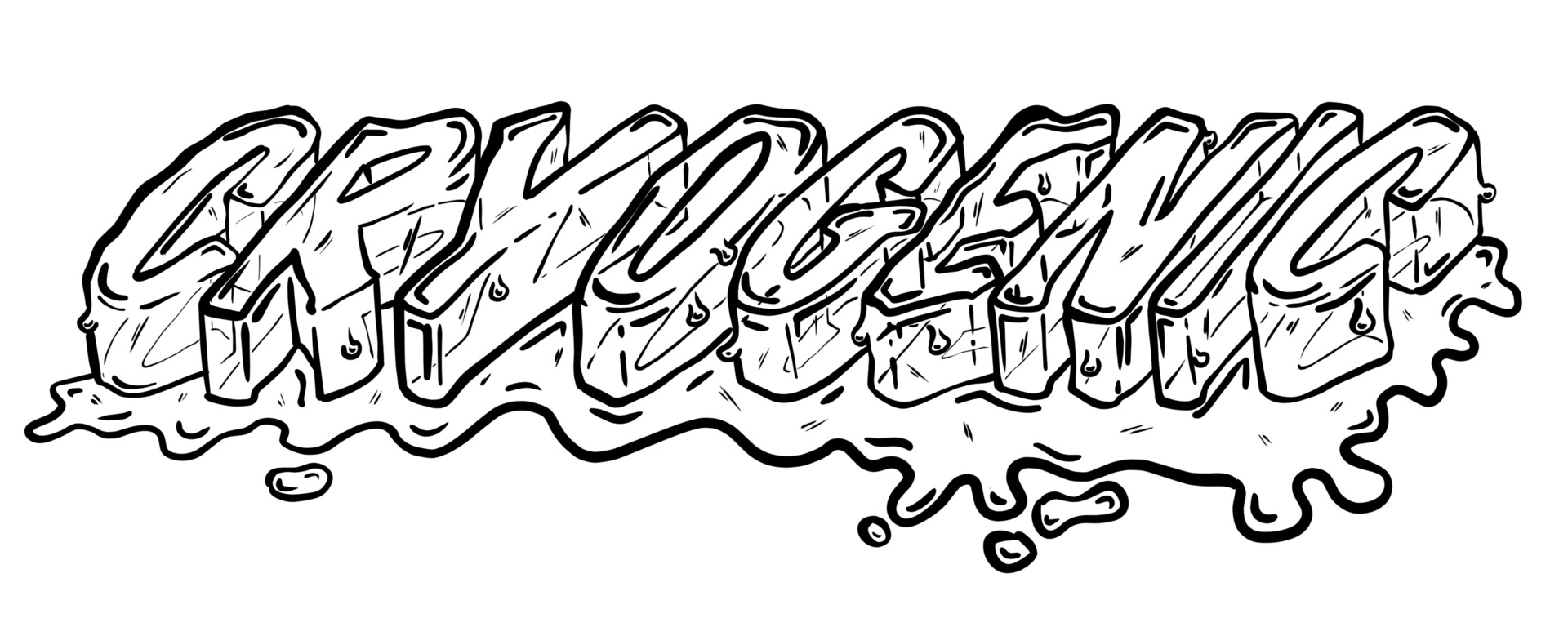
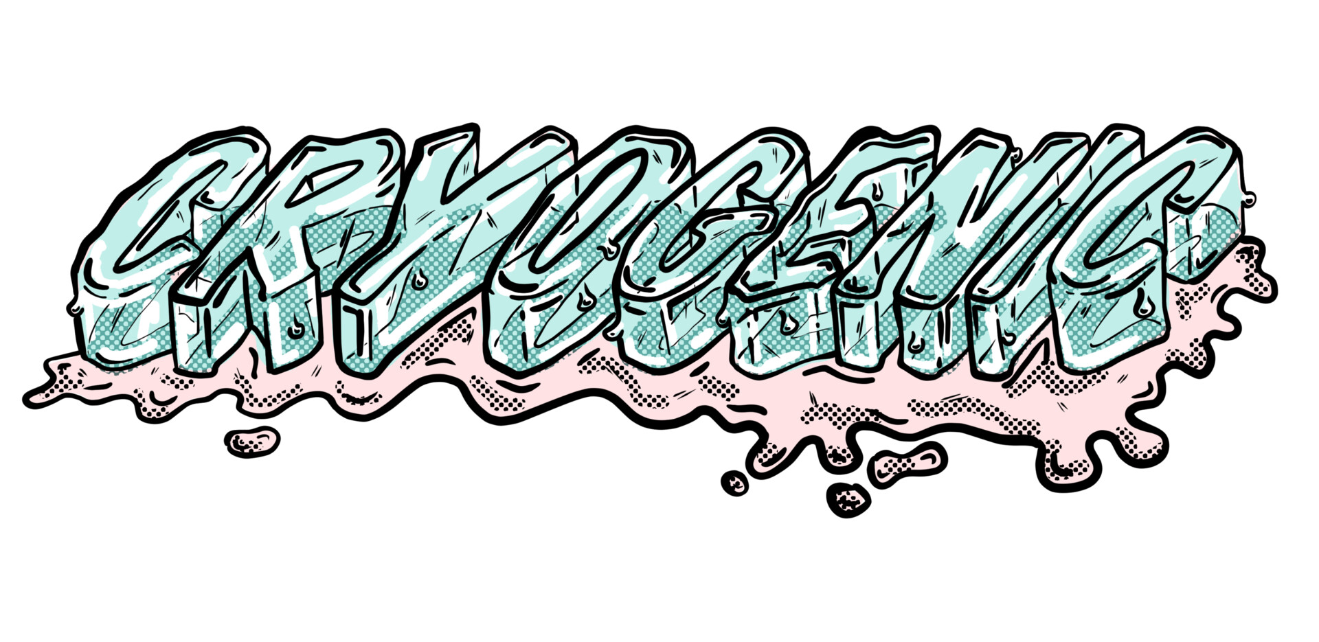
The final design feature to establish was the logo. I chose the title to be a form of melting ice. This was to reference the "cryogenic" state in the title and instill eeriness through the melting of ice by foreshadowing that the cryogenic state is not meant to remain or is flawed somehow. 


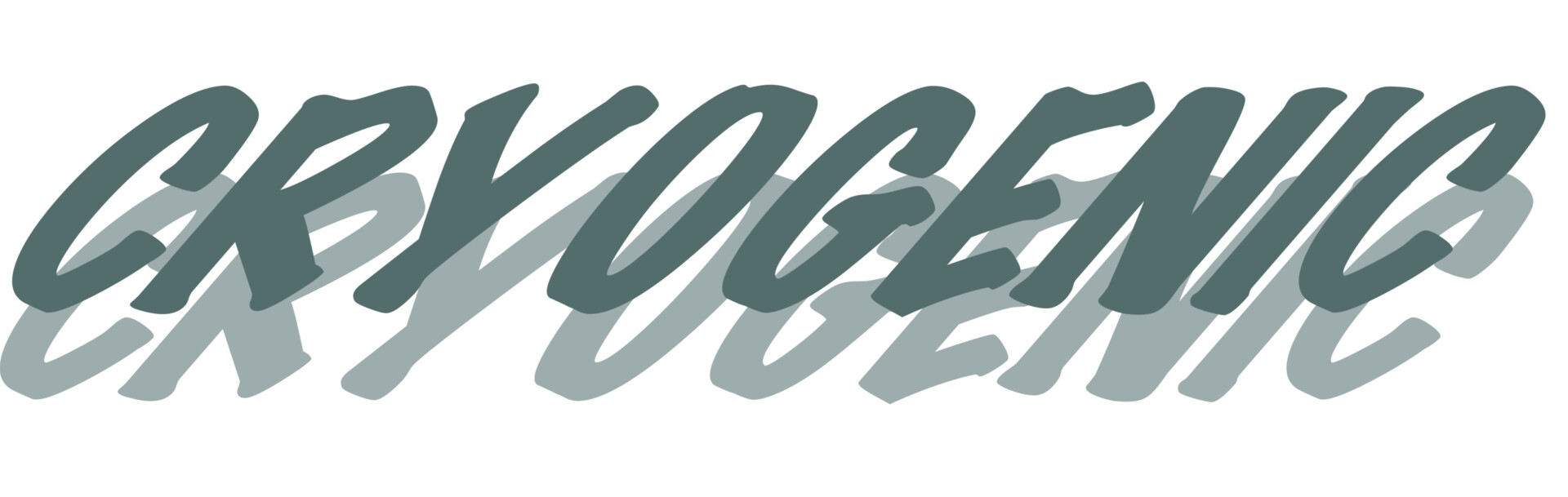
       In Figs. 9-11, I have broken down the creation process for the logo design. I traced over two layers of chosen font that I skewed and overlapped to allow me to visualize the three-dimensionality of the melting ice title.

Fig. 9 Font of choice, skewed and duplicated


Fig. 10 Pencils of Logo over the font of choice


Fig. 11 Final Pencil of Logo


Fig. 12 Ink of Logo


Fig. 13 Final Logo


Fig. 14 Chapter title page


I then inked the final pencils and colored the logo, as seen in Fig. 12 & Fig. 13. I made sure to include halftone in the logo colors, as halftone will be a large part of my coloring process later on. Fig. 14 is the chapter heading for my webcomics. I intend to continue to include my brand logo and expect to change the color schemes of the title logo to suit each chapter.


Drawing Process:


Fig. 15 Chapter thumbnails


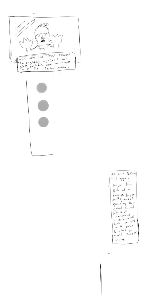
With my characters and logos now established, I felt ready to thumbnail my chapter. Fig. 15 is single clip canvas housing all my page thumbs. Each page is formatted at 800px by 4000px ratio in order to correspond with the max canvas size I will then blow them up for my final webcomic canvas, which are set to 4000px by 20,000px (at 1200dpi) in a clip studio .cmc folder.


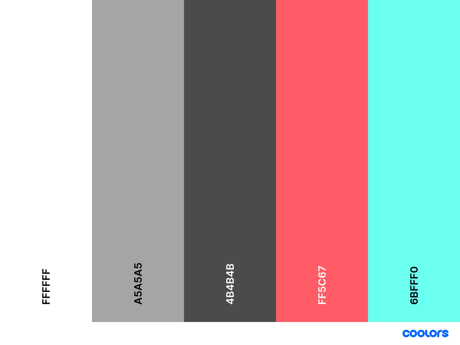
Fig. 16 Color scheme for the first part of chapter and logo


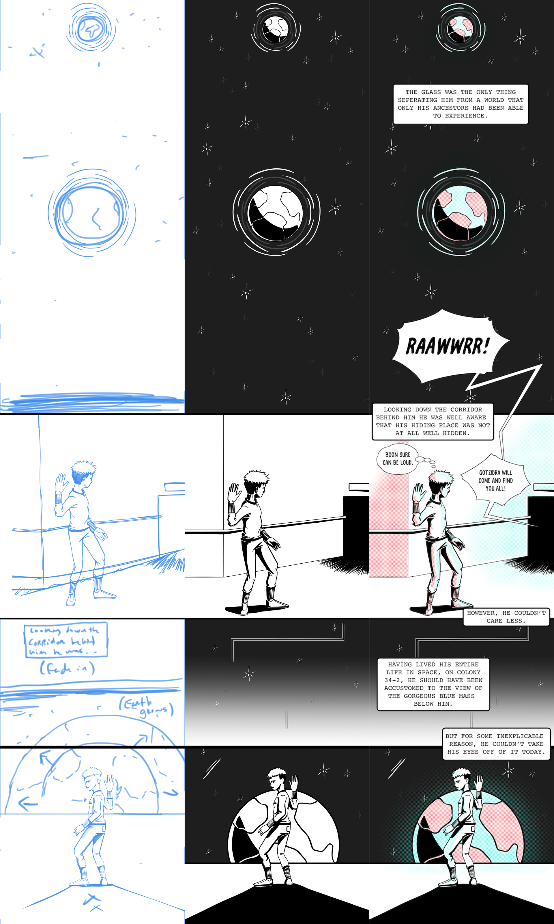
Fig. 17 Pencils, Inks and Full colored static version of Cryogenic ch. 1 pg. 2


Fig. 17 is a step-by-step process from pencils to the final colors of page one in my .cmc file. I chose to color the first segment of my chapter, a dream sequence, with the color scheme seen in Fig. 16. I wanted complementary colors that would pop amongst the backdrop of space. An interview with Tillie Walden inspired me, where she pointed out that most sci-fi's are grey and monochrome, and I felt I could somehow also contribute to a change in that perception of sci-fi stories. 


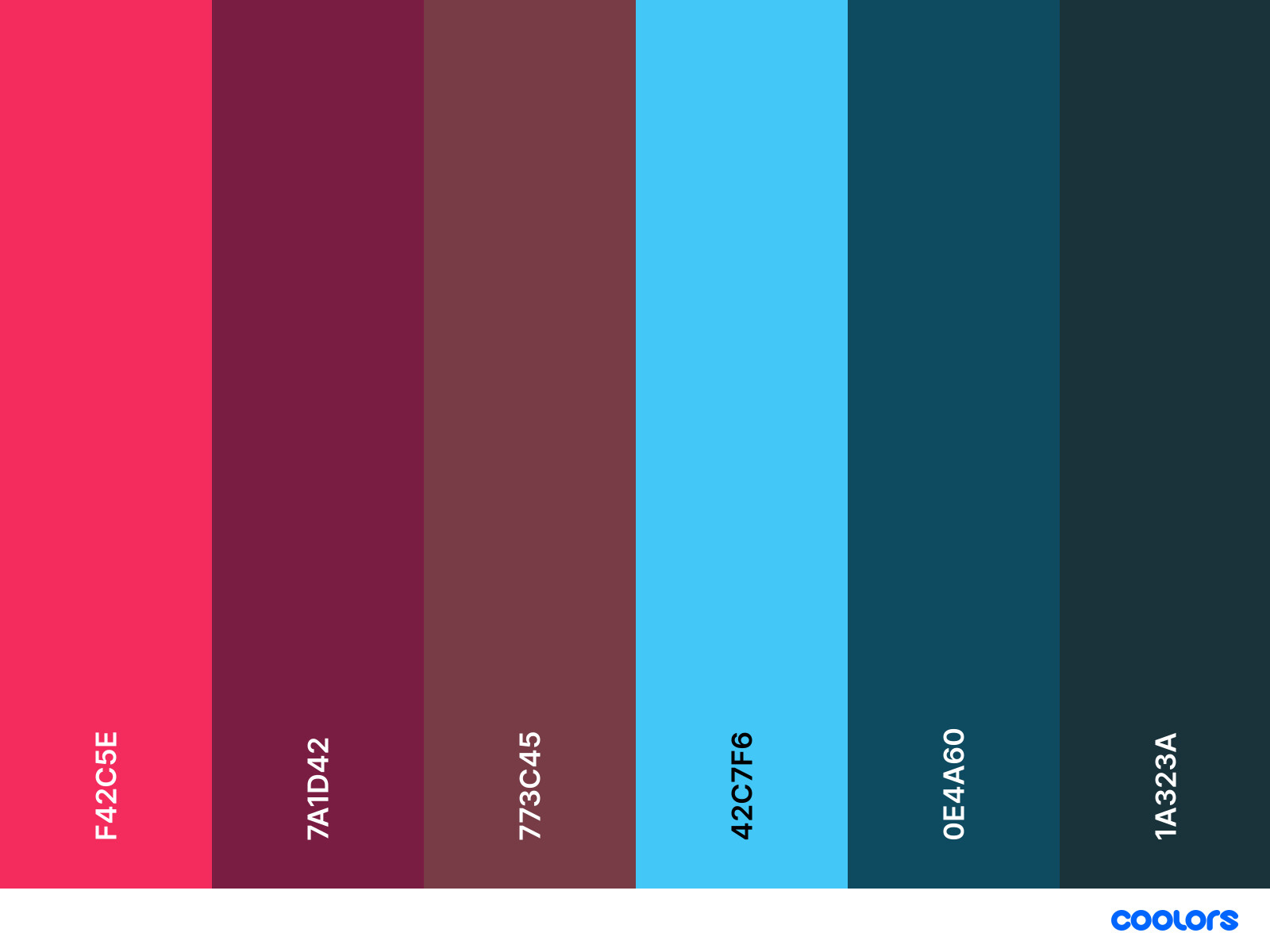
Fig. 18 Color scheme for the second part of chapter 1


Fig. 19 Ink to complete color stages of the second part of chapter 1


Sticking to my concept of popping colors, Fig. 18 is my chosen color scheme for the second segment of chapter one. The blues are colors relating to Hal's perspective, and the reds relate to Boon's perspective. Going forward, I plan to have a separate color scheme for each character and one primary color scheme for when multiple character stories merge. Fig. 19 show's how I have used the colors from Fig. 18 on page 5 of my webcomic .cmc file. 


Uploading Process:


Fig. 20 Landing page for Cryogenic webcomic


With my comic drawn up, I was ready to start uploading. The first task was to create a landing page for my webcomic with chapter selection. This would be the page the drop-down within each chapter would take you to. Fig. 20 is a screenshot of the final landing page. 


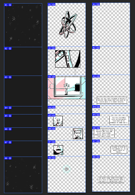
Fig. 21 Cryogenic ch.1, pg. 1 layers, sliced in Photoshop


       The next step in the uploading process was to export all my webcomic pages into separate .png layer files. Then I imported the files into photoshop, each page image as a separate layer within the .psd file. I then sliced each page to create specifically identified elements. Fig. 21 is an example of one of these pages. This process was the most crucial aspect as it was what enabled me to attach parallax animations to particular items in the webcomic. For example, Slice #1 and #8 in the middle layer were enlarged during scroll, and nearly all the text elements were faded in while scrolling.


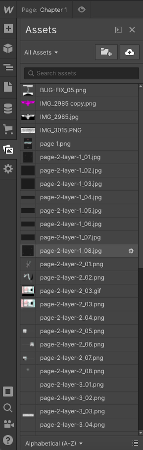
Fig. 22 Cryogenic ch.1 image segments uploaded to webflow


       A significant aspect of making this entire process feasible was organization. Before slicing and before uploading onto webflow, I made sure to understand how each layer would behave, and then each file was labeled with an appropriate file name that would ensure my workflow was as smooth as possible. Fig. 22 is a snapshot of only a few files and my naming system. In total, I had 136 image files. 


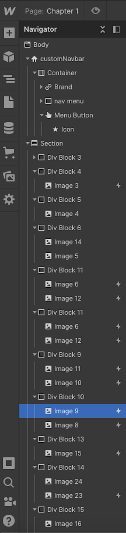
Fig. 23 Cryogenic ch.1 structure in webflow


       Fig. 23 shows the webcomic structure. There was probably a more efficient method to go about structuring this chapter. But to meet deadlines, I chose to go with a simple approach that I already understood. Each individual slice of a webcomic page is housed within a Div Block that contains the various layers for that slice, allowing me to attach animations to a particular item without affecting any of the other div blocks on the page. 


Conclusion:


The resulting webcomic was far more successful than I had imagined. I have managed to make the webcomic accessible on a variety of devices. For the smallest screens, I had to remove the shatter effect over the illustration of Hal, which is in the middle of the storyline. I did not mind this compromise, as the plus side meant that small mobile devices could view the rest of my webcomic without issue.

     However, I have encountered bugs specifically on android mobile devices. My research on the issue confirms that this is unique to androids only, as they use a different flexbox plugin than all other devices. Flexbox is the element in browsers that can translate the HTML coding for parallax effects. The bug can be mended. Though, I have yet to discover which particular piece is the cause.

     All in all, the uploading process was far smoother than I expected. I feel that the additional animations are effective in amplifying the narrative. I did go a bit crazy with all the added elements, mainly for experimentation. Thinking on the long term and for the future of my webcomic, I would most likely limit the animations to a couple per chapter and in areas where I felt this would add enhancements to the narrative. Examples of the elements in my webcomic, which I felt were particularly enhancing, were the growing earth, Hal shattering, Hal falling to earth, and the final element where the Clank sound from the door appears multiple times. 


To read the chapter click here.

The Making of Bowdlerization

Making Of / 30 August 2021

Bowdlerization is a comic where a small robot gets revived by an old human friend of his. In this essay, I will discuss the thoughts and processes behind the creation of Bowdlerization, highlighting both plot, story structure, and production process. 


Story Origin:

I tend to start with plot or world ideas before anything else usually. I try my best to jot down any spur-of-the-moment thoughts, so you'll find my phone is filled with one-line notes of hypothetical situations that I hope to one day get to. Occasionally, some are more non-sensical than others, like: "A polytheistic polyarchy where everyone is polyamorous" or "a pessimistic optimist meets an optimistic pessimist." So, at its  start, the idea for Bowdlerization was simple. A story where a man is attempting to rebuild a robotic companion he had lost in his youth.


This idea stemmed from a current collaborative project that I am working on (with the incredible writer Natasha Marie) called Coin Operated Clone. My favorite character within this story is the main character's robotic companion SAI, which stands for Symbiotic Artificial Intelligence. This story takes place in a very distant second post-apocalyptic universe, and every time I draw SAI's character, I can't help but wonder what sort of technology his "ancestors" were. So I often like to imagine more ancient-looking versions of SAI that exist in a not-so-distant future. And because I have such a fond attachment to the character, I want to imagine that someone in the not-so-distant future would have a similar attachment as well.


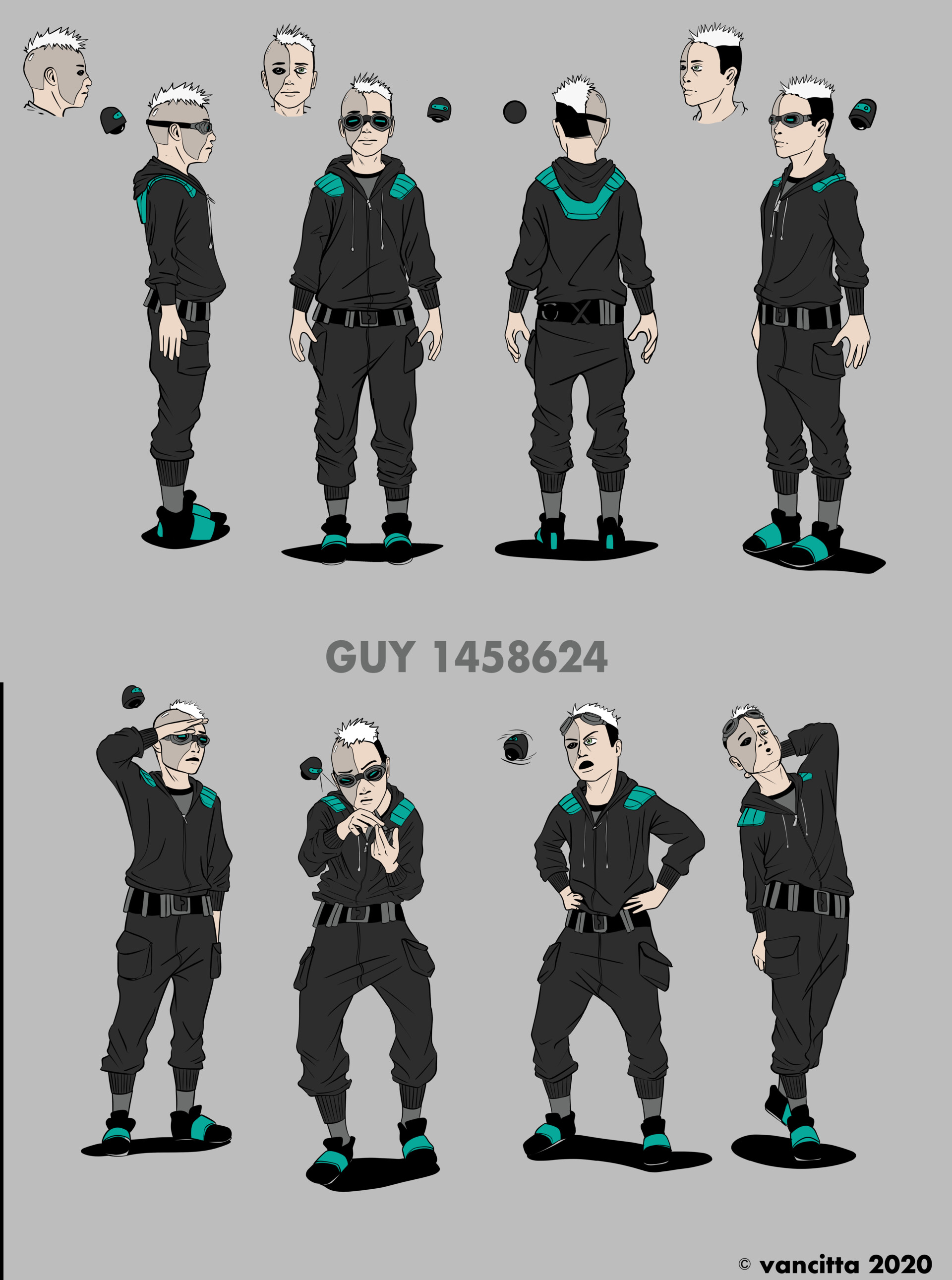
 Character sheet for Guy & SAI from Coin Operated Clone (co-created with Natasha Marie)

Plot & Script:

With my rough story conceptualized, my next step was establishing further details within the story. My main concern being the world, and answering questions like "what was the robot and the man's relationship" and "why is the man rebuilding this robot?" and essentially, I found that the answer to these questions was influenced by the world the story would take place. With this sorted, I was then ready to brainstorm a title and develop a clear longline before attacking the script.


Title: Bowlderization

The title is a play on the word Bolderize; definition: to remove material that is considered improper or offensive from (a text or account), mainly because the text becomes weaker or less effective.[1]


Logline:

While reminiscing his past, a survivor of a revolutionized technology-free society attempts to rebuild his mechanized childhood friend.


Even though the project scope had a 12-page limit, I went ahead and allowed myself to fluidly write the script for the story as it came to me. Unfortunately, that resulted in a 17-page script. So the next step in my process was to condense and cut out five entire pages of content. Because Manga is a huge influence in my work, reducing is a challenge, but I found it to be an exciting process. 


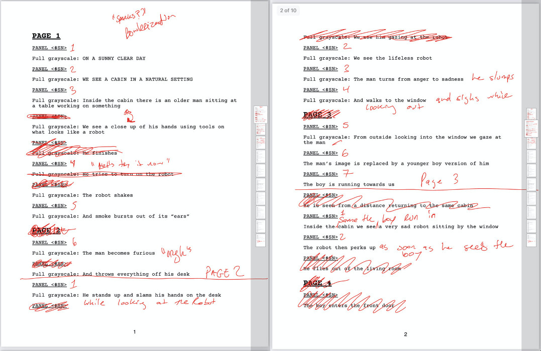
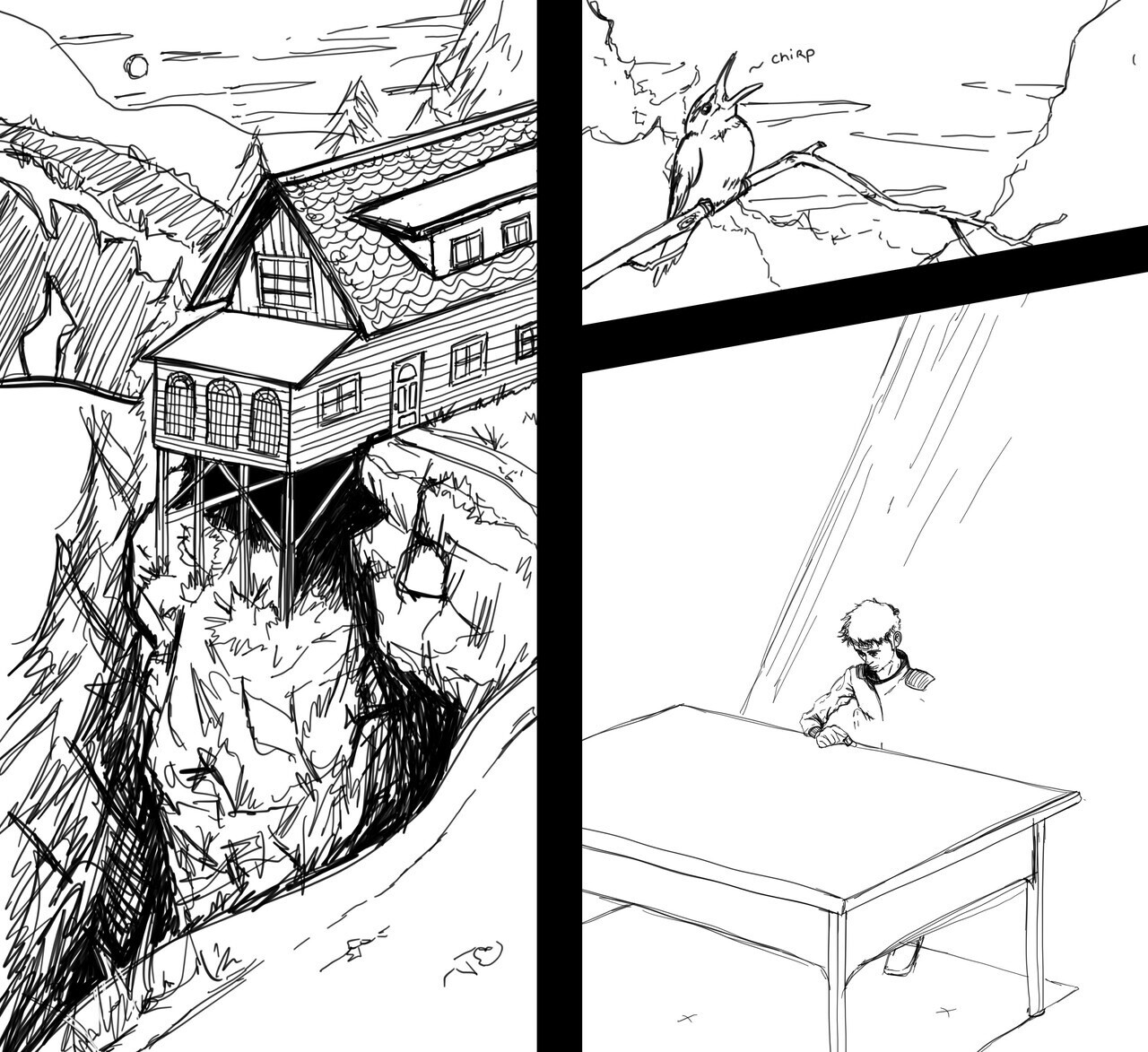
I've attached two examples of pages of my script and how my condensing process looked. I focused on developing scenes that would tell multiple events or actions within one image. This sort of image structuring was outside of my comfort zone. However, I do feel like I managed to grasp the entirety of my original 17-page script within the 12 pages without compromising any events. Before long, my script was down to the required 12 pages, and my next step was thumbnailing. 


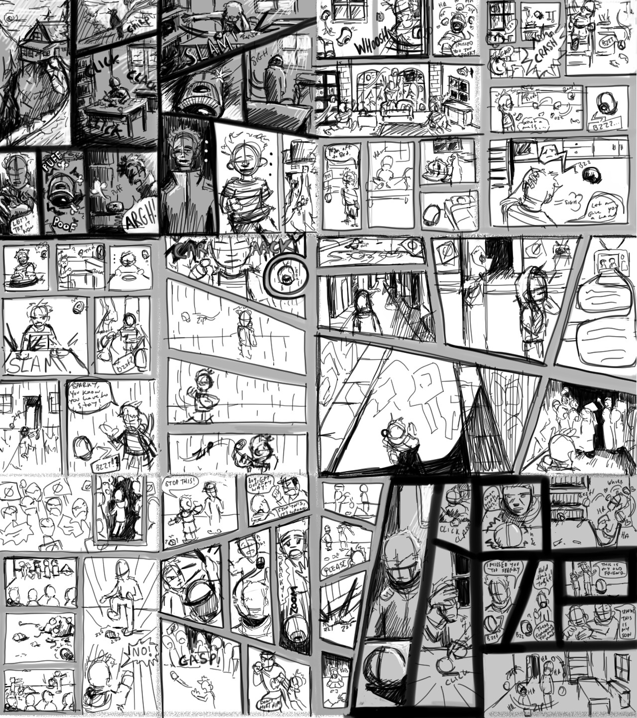
My experience in comic development until now has been for webcomics. When thumbnailing for webcomics, I became accustomed to thumbing my chapters within the same clip file because the panels are in an infinite scrolling format. I found that using this same method for my Comic allowed me to see the overall layout design of the pages. The panel layouts and their structure became extremely important during this stage. I found myself obsessing to ensure that each page layout created an entirely different feeling without becoming too foreign from the rest of the pages. 

With my thumbs completed, I then cropped them apart and placed them side by side in a word doc. This word doc then became my blueprint for production. I always like having the script at hand to allow me to fully tweak an image during penciling without missing the plot points of the images. 


Character designs


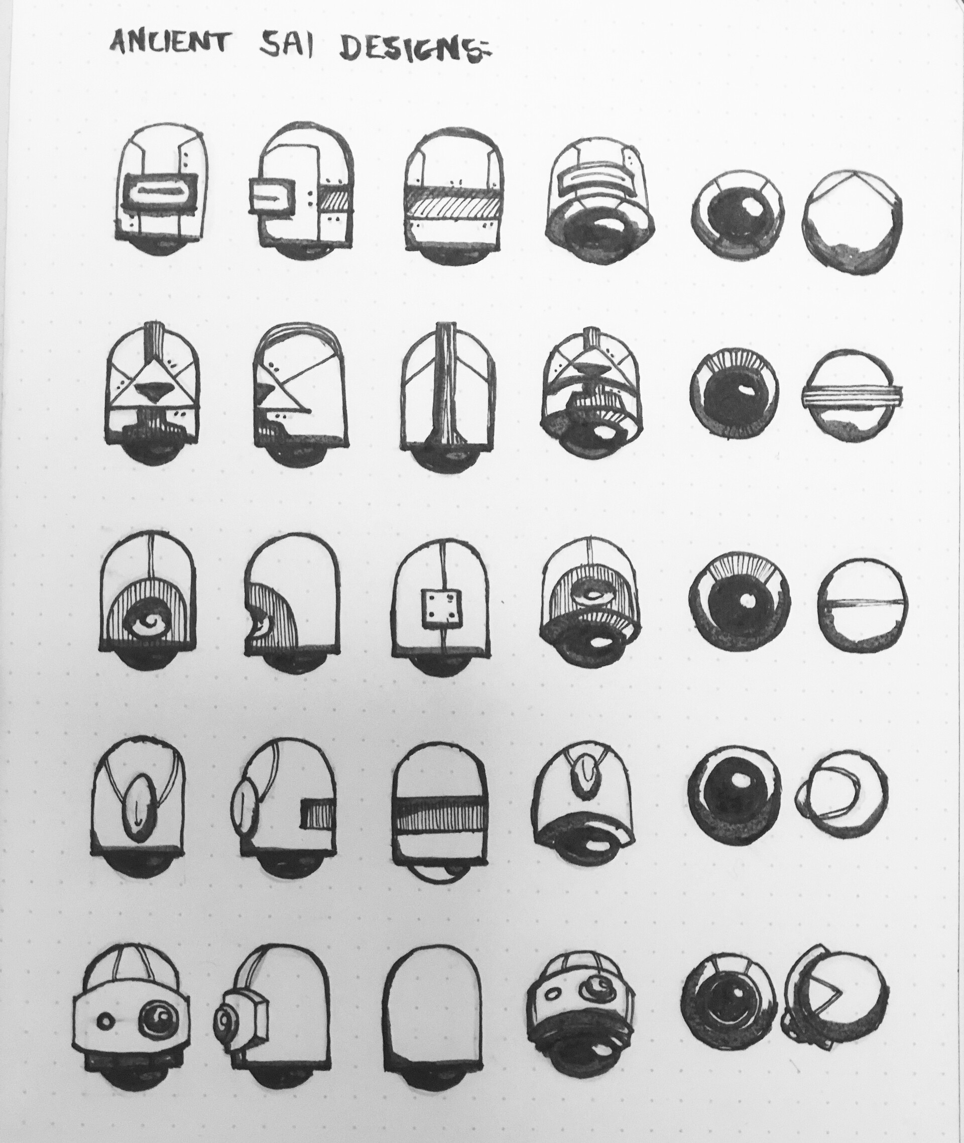
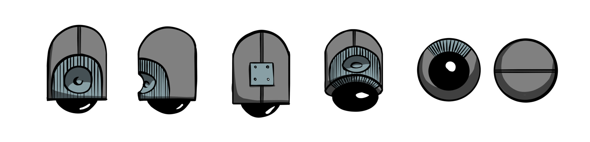
With my script essentially drafted, I then began to think about the characters and they're aesthetic. Because I was inspired by SAI from Coin Operated Clone, I started by drafting some more "ancient" looking versions of SAI. The original SAI design derived from the two cameras found on the back of my iPhone 8 plus, but because this was meant to be reminiscent of SAI yet not quite identical, I tried different things out. 


These are some of the quick designs for an ancient SAI companion.


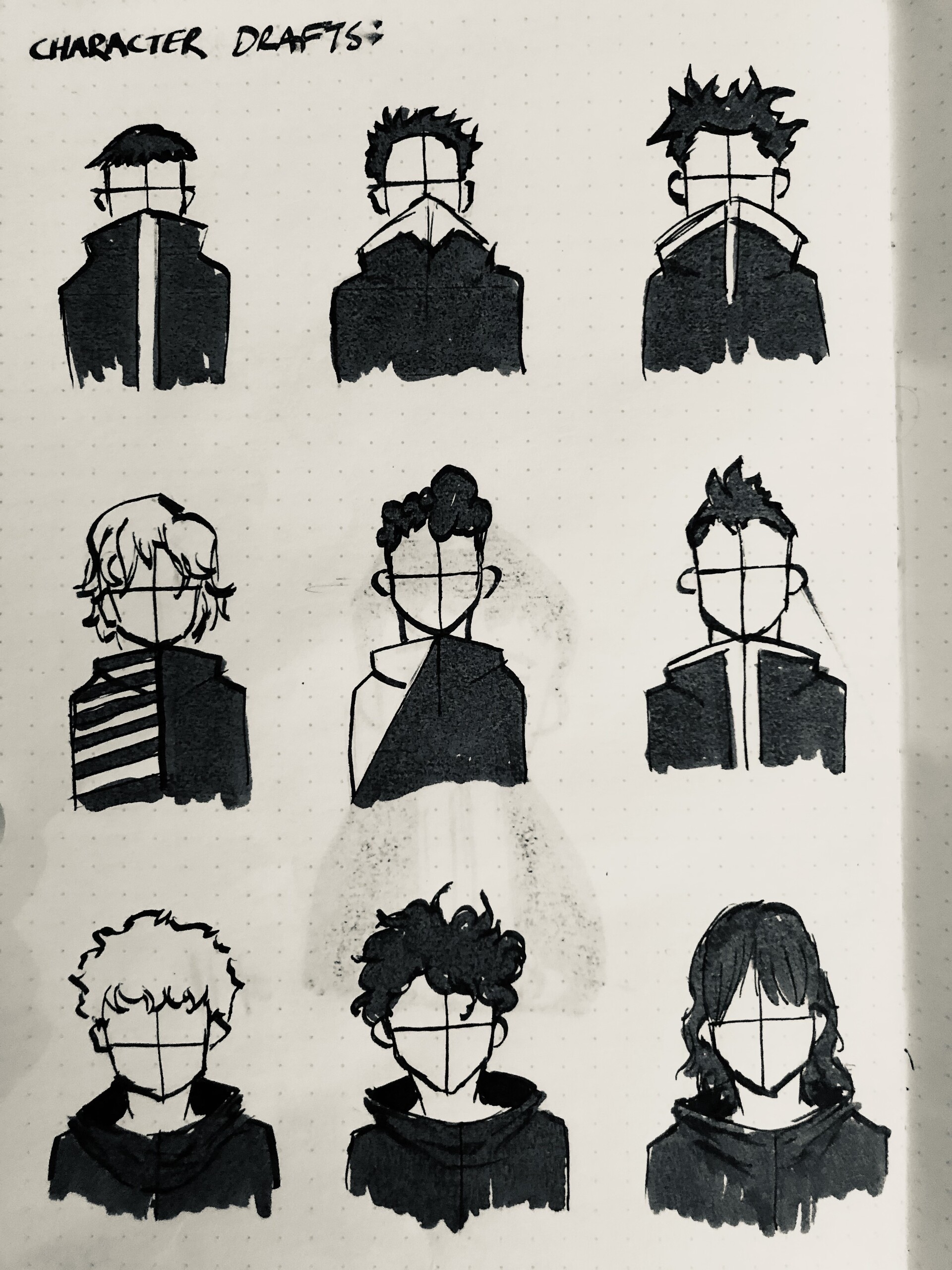
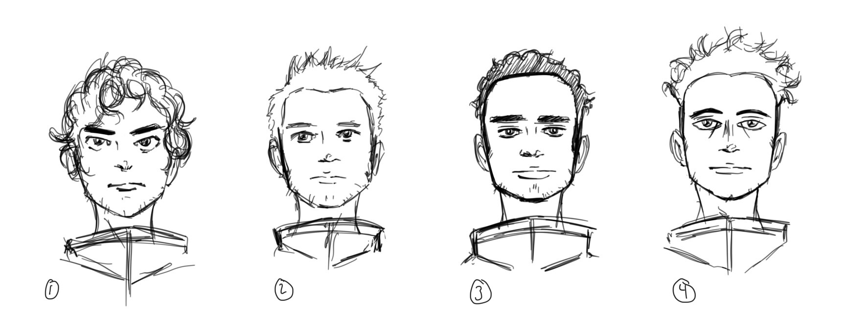
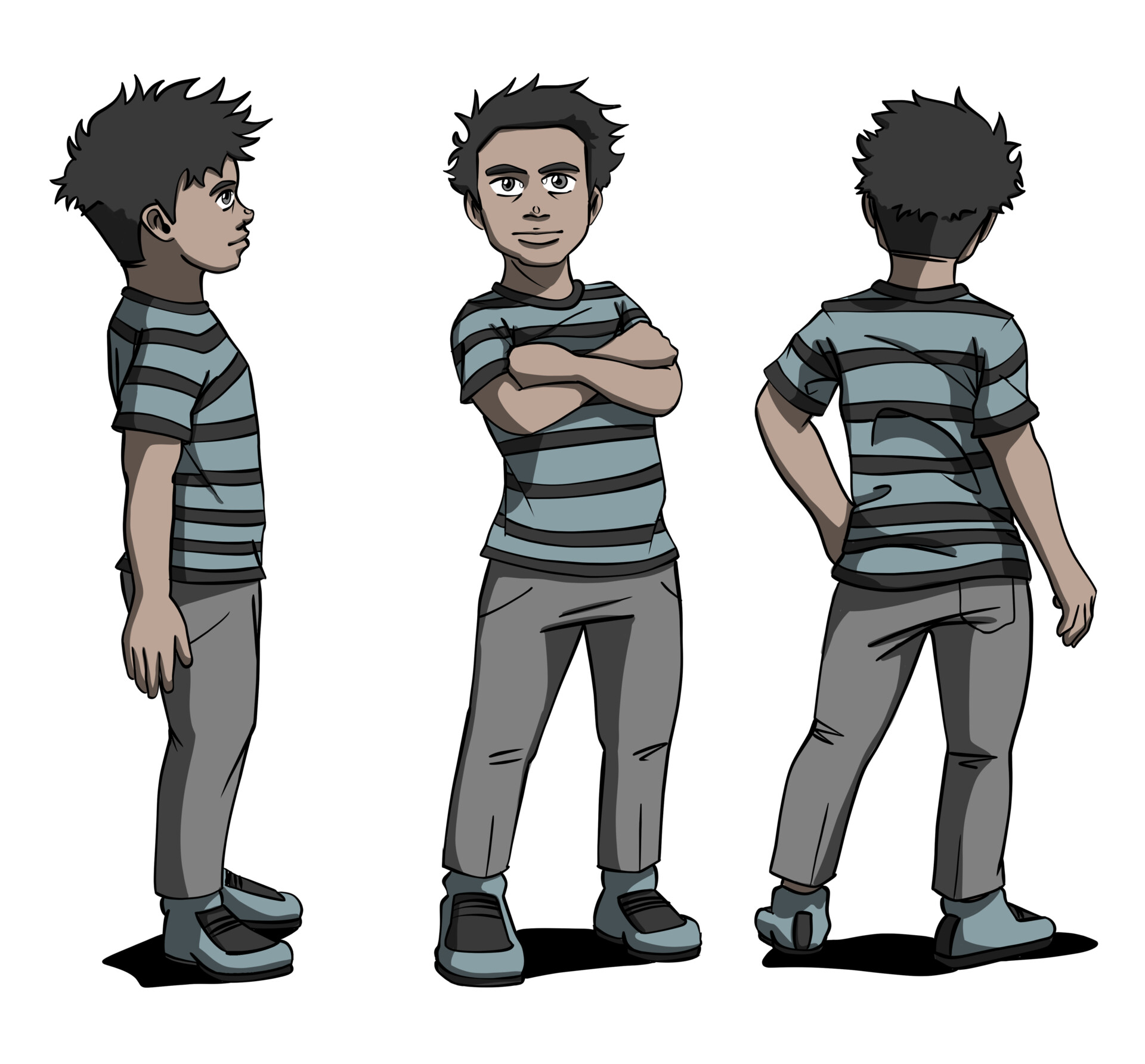
I used a similar fast brainstorming process for the Main Character. But because the main appears in the short in both his adult version and child version, I decided it'd be easier to establish his adult version first. I have included an image of my tests below.
 

I started with very quick and vague figures. Trying out different hairstyles and clothes. I know I wanted his clothing collar to be quite high, so I was using this as a way to figure out exactly what kind of collar I was looking for, and to get a sort of rough idea of and design patterns that would give off a vibe that I was looking for.  


Then I drafted out a few facial designs. I was undecided between design 2 and design 4. Design two seemed far too young for the age bracket I want my character to fall into and. Design 4 just doesn't feel empathetic enough for the role the main character has. So I compromised and went with a combination of the two.  


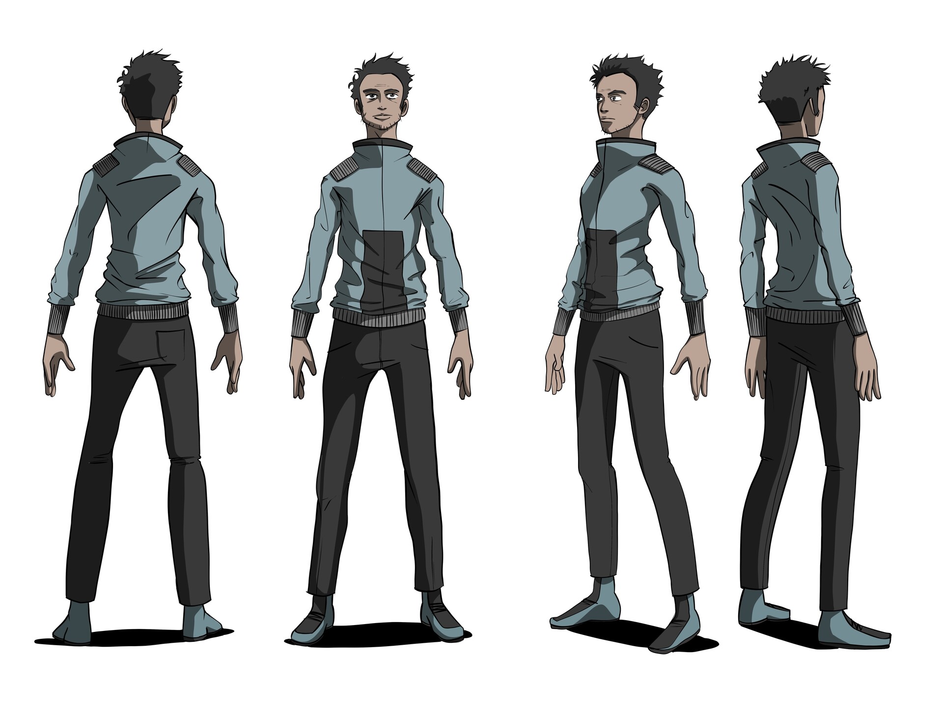
In the Final main character design, I went and added some more facial lines to increase his age.


Then came designing his younger self. Of course, I had to have some features cross over to help identify the character as a singular entity, so I made sure to draw his har in a similar pattern but larger, and I added long eye lines handmade a mental note to not give any other characters in my short similar eye lines.


The final design of young version of Protagonist


And finally, for the SAI design, I choose to go with the third draft option and I cleaned it up and gave it a matching color scheme:


Production & Process:

Then I began penciling and digitally inking my first page. In my mind, this first page was going to set the stylistic tone for the whole work so I focused on establishing the kind of inked and colored process it would have. I tried out a few different versions of the ink and still felt slightly frustrated. I found that the thumbnails had far more interesting qualities than the cleaned-up digital inks. It was just clearly bland and lacking character.


The start of my pencils.


Here are the nearly completed digital inks. I normally just use the standard default G pen on clip studio.


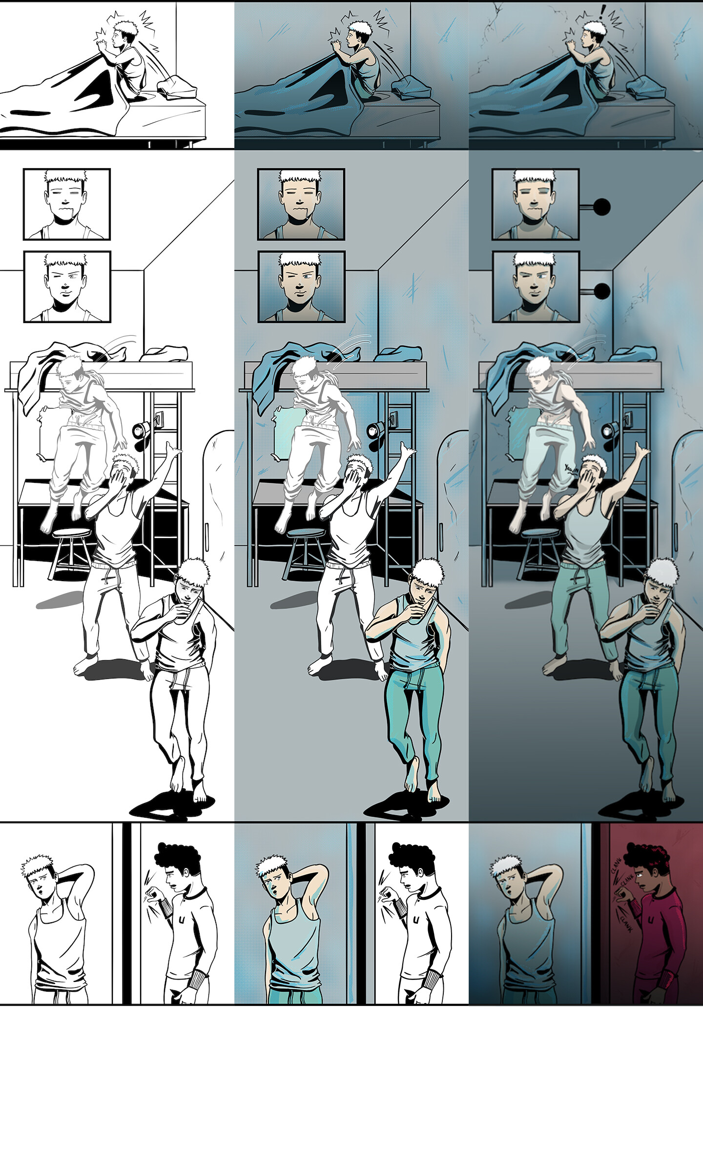
Some first tries at coloring. I was attempting to find a clear way of distinguishing the two timelines of the main character.


I also began experimenting with a different brush to try and attain the aesthetic I was looking for. I brainstormed some possible solutions with my professor on how to maybe achieve the feeling that I had managed to capture in the thumbnails. One suggestion of his was to work at a very small scale and blow the image up, as perhaps that method may have contributed to the rough feel of the thumbs themselves. Another suggestion was to print the pencils out and ink traditionally, I had been undecided on getting a printer to experiment with this but his suggestion confirmed that it was a must. And so I chose to go with the traditional inking over my digital pencils. 


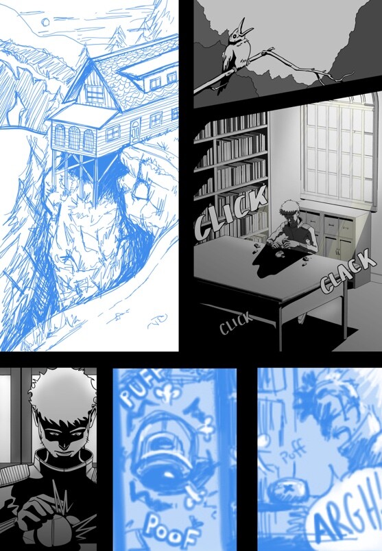
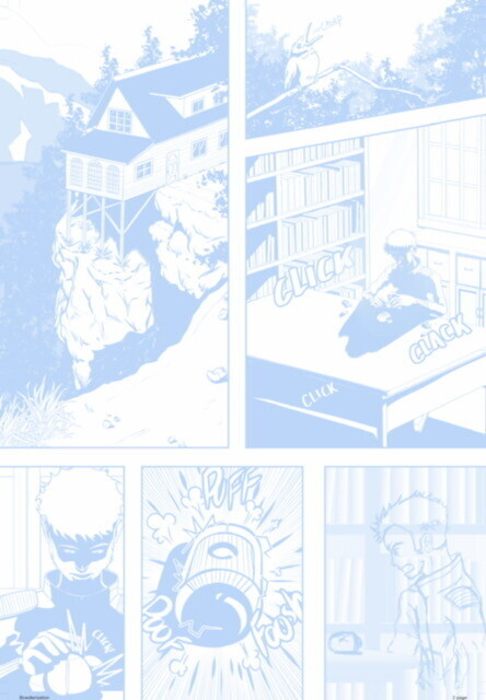
So the next step in my process was now to print my digital pencils and experiment with traditional inking techniques. I will use page one from my comic as an example. I hadn't drawn or worked traditionally in years so I was simultaneously terrified and excited at the prospect. When printing my pencils out I chose to go with 35% light draft color blue, and in fact found that the grayscale or B&W scan setting on my scanner was able to effectively eliminate the blues from my final inked scans. Which is quite lucky as most modern printers can pick that up.


My blue digital pencils.


The traditional inks over the pencils scanned through at 1200 dpi.


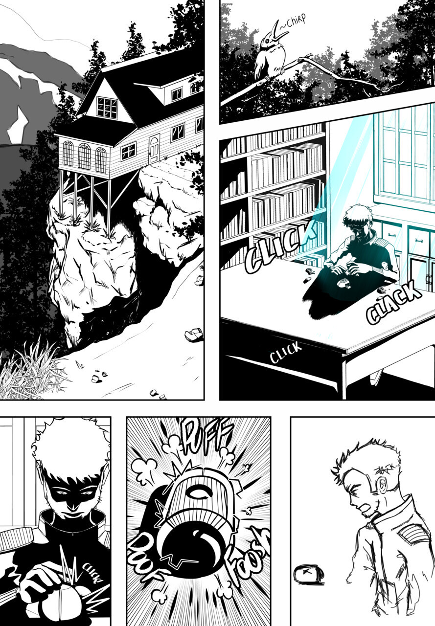
Increased contrast and cleaned up any smudges or errors that had occurred in the inking process. I also went ahead and added a few digital lines to the facade of the house and the burst lines around SAI in the 5th panel. Then I added any finally tweaks and the addition of speech bubbles. I experimented with color, but while working on the project I fell in love with the black and white version of them. Ultimately, I chose to stay with this color scheme as it just felt closer to the aesthetic I had been striving for from the start. I have included old colored trials of a page below. Some minor tweaks that occurred along the way was the reduction of font size which Damon had noted was too large at the start. I also added a white line on the 5th page, to more clearly link the time panel with the Oven in the panel prior. 


Cover:


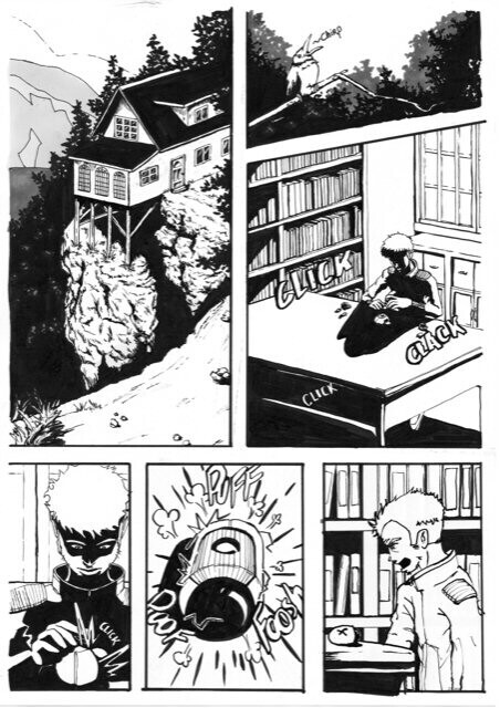
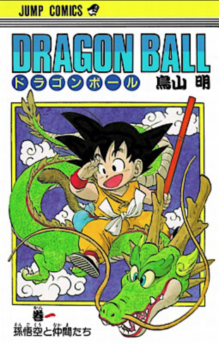
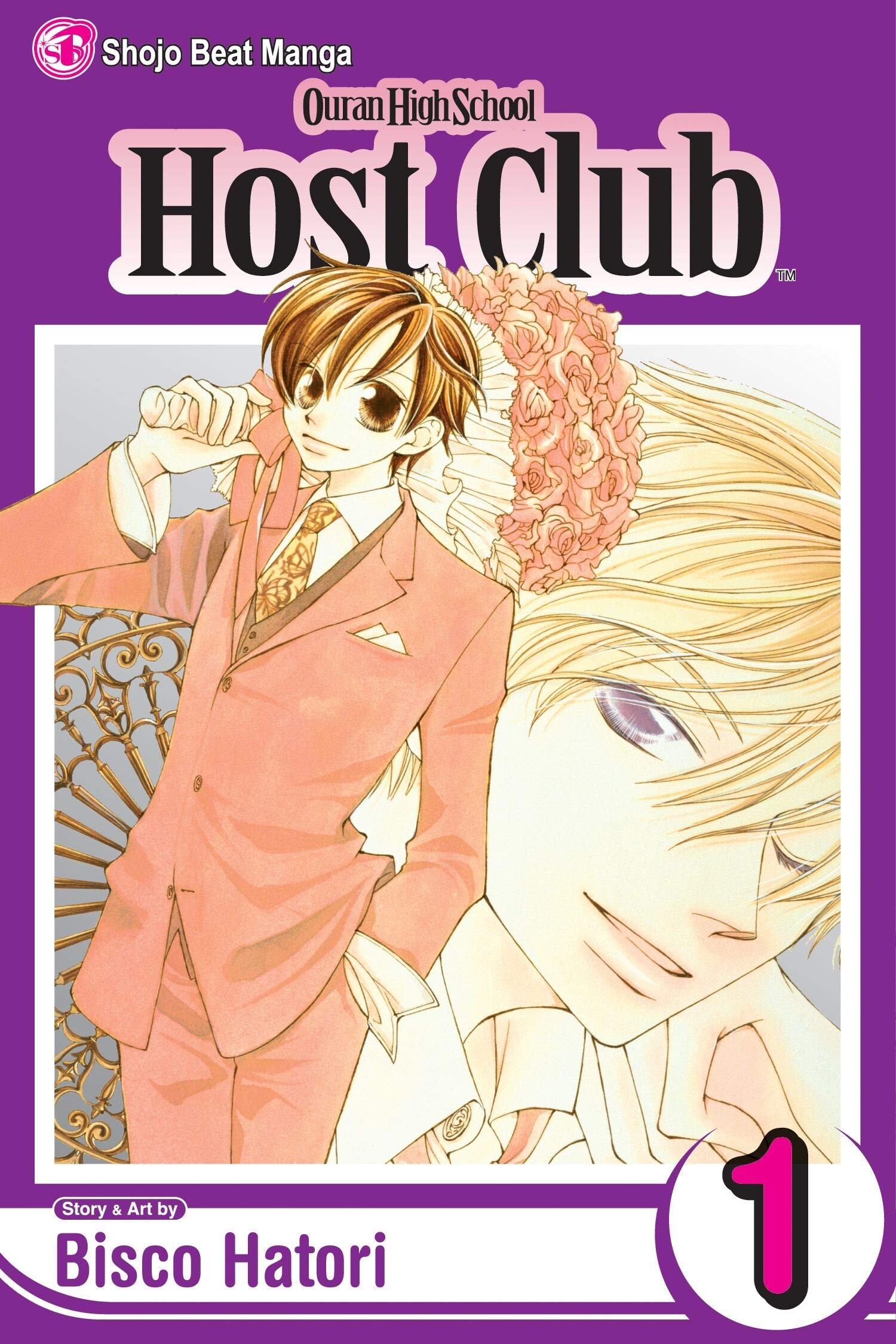
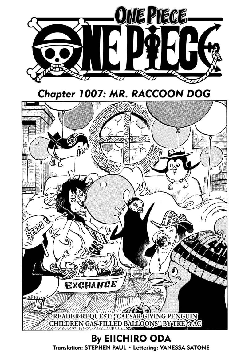
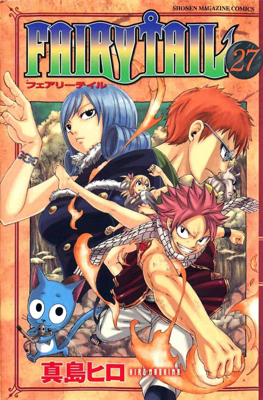
(Top) Dragon ball Vol.1 Cover, ( Middle Top) Ouran High School Club Vol. 1 Cover, (Middle Bottom) One Piece Chapter 1007 Cover, (Bottom) Fairytail Vol. 27 Cover


Because Manga greatly influences my comic Bowdlerization, for its cover I was inspired by classic manga cover designs centered around a square within the page layout. Above is a collection of examples in Manga that use the square backdrop. 

First Drafts of Cover


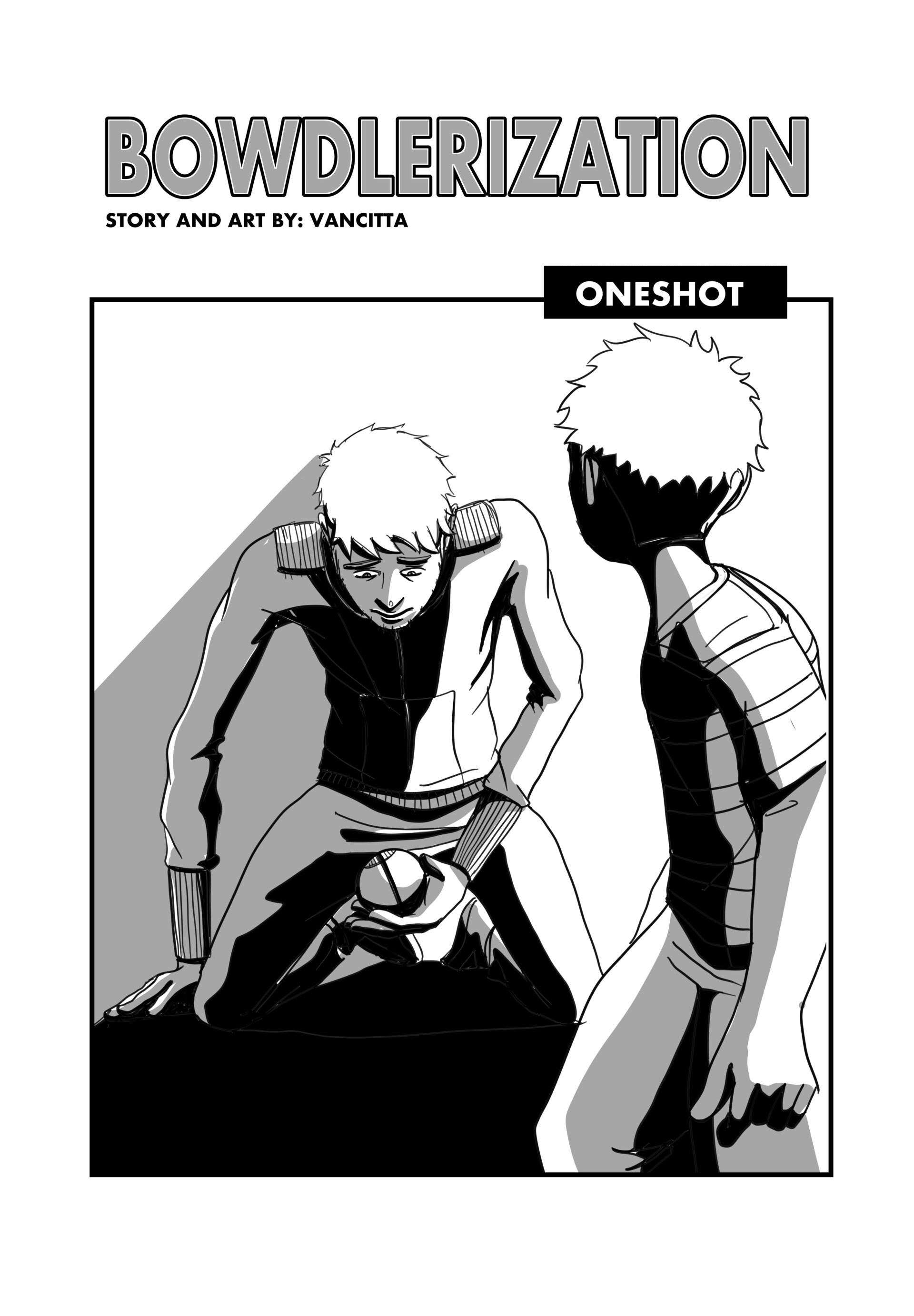
The Images above shows my first two draft ideas for the Bowdlerization cover. I wanted to highlight the regret felt by the main character, which was the driving force behind the entire story, so I felt there had to be some connection between the young version of the main character and his older counterpart. I chose to go with the cover on the left as I felt the photograph accurately depicted how older people reminisce on the past. The character positioning in the draft on the right somehow unintentionally ended up with sexual connotations. 


Second Draft of Cover


In the image above, I elaborated on the draft; I added colour and graffiti to the square backdrop in reference to the double-page spread of my comic where the main character is walking through a graffiti-covered town. However, the cover required a few fixes (the title in particular), and I felt that the logo stood out too much (as by this point, I had not yet decided to make the white space within it transparent). 


Final Cover


In the final cover, I felt I succeeded in creating a title text that referenced the graffiti in the story without losing the legibility of the title name. I also improved the logo placement and the shadow of the robot, which is placed at the bottom of the page to insinuate that he is there looking over the main character as he looks at a photograph of them from the past. 


Conclusion:


The entire project from start to finish was highly experimental for me. This made it a very challenging project, and extremely rewarding as well. I am quite satisfied with the end results. With previous projects I always felt like the end results weren’t quite how I’d hoped, but for Bowdlerization, I feel I managed to accurately put on paper the concept of the story that originated in my mind, which is a first for me. I strongly believe that this is due to adding the traditional aspect to my production process. I feel it’s given me the extra ability to manipulate the concept from their pencil stage to it’s most suitable inked version. In my next projects I plan to play around with the color of the ink. I wanted to experiment with blue tones for ink color in this project but I ran out of time. But It will most certainly be my next experimentation!

To read the full comic click here.
[1] Merriam Webster Dictionary <https://www.merriam-webster.com/dictionary/bowdlerize#other-words> [accessed 20 April 2021].


Ideas 1

Work In Progress / 21 January 2021


Amidst the temporary housing hopping and flat viewings, this marks the end of my first week of my Master’s in Comics and Graphic Novels and as part of our course we need to document our process.

I tend to usually start with plot or world ideas before anything else (so this first blog post will mainly be filled with thought processes more than artwork). I try my best to jot down any spur of the moment thoughts so you’ll find my phone is filled with one line notes of hypothetical situations that I hope to one day get to. Though, some are more non-sensical than others (for example: “A polytheistic polyarchy where everyone is polyamorous” or “a pessimistic optimist meets an optimistic pessimist”).

But in preparation for the course i’ve been diligently racking my brain these past few weeks for any potentially usable ideas and I feel like I’ve managed to conjure up atleast 3 for now. (If only i could predict when they come at me)


 Character sheet for Guy & SAI from Coin Operated Clone (co created with Natasha Marie)
These are some quick designs for an ancient SAI companion. The original SAI design derived from the two cameras found on the back of my iphone 8 plus.

The first is an idea for a story where a man is attempting to rebuild a robotic companion he had lost in his youth. This idea stems alot from a current collaborative project that I am working on (with the incredible writer Natasha Marie) called Coin Operated Clone. My favourite character within this story is the main character’s robotic companion SAI, which stands for Symbiotic Artificial Intelligence. Now this story takes place in a very very distant second post-apocalyptic universe and every time I draw SAI’s character I can’t help but wonder what sort of technology his “ancestors” were. So I often like to imagine more ancient looking versions of SAI that exist in a not so distant future. And because I have such a fond attachment to the character I like to imagine that someone in the not so distant future would have a similar attachment as well.
An illustration I did a while back titled Compulsion

Another story idea is based on my experience with OCD. Which, to some extent I’m not entirely certain I am comfortable writing about just yet. But it’s definitely been something thats brewed in my mind a lot. I really like the comparison of OCD as a seperate entity because a lot of the time it feels that way as it’s thought processes are based on things that are completely irrational, and you are fully aware of the irrationality of it, yet despite that awareness at times you can’t fight it.  So I sort of have an idea in mind of a child growing up with a kind of imaginary friend/monster that has an insatiable hunger and the boy feeds it compulsions and it grows and consumes aspects of his life. 

Quick brainstorming, playing around with shapes, trying to get a feel for how these idea creatures could look.
Another story Idea came to me while listening to chapter 2 of Big Magic, its a chapter where she basically says that if only creative ideas just organically came to you, and you somehow created some sort of energy that attracted them to you. So it got me thinking what if it did work that way? And in some invisible realm around us there exists spiritual/anthropomorphised embodiments of ideas/thoughts. In other words creature like representation of thoughts (like “I feel fat “ or  “we should be treated equal” or “we need an invention like the mop” or even negative derogatory thoughts) and these sort of weird awkward creatures that are invisible to us, basically scatter across the world like insects, trying to find viable hosts to inhabit. But maybe not everyone is a perfect fit? This is probably the least incubated story idea of the three but I feel its mainly due to the fact that it can go in so many directions. And I need to find my position within this mini world first before I can begin to comprehend what kind of story I would like to tell.

So yea so far that’s where I am at, still at the very beginnings, though I feel like I need to put on my big boy trousers and crack on XD